Sora Classes
A Homepage for Students' Classes
Work
UX / UI Design
Data Visualization
UX Research
Timeline
Nov 2021 - Dec 2021
Role
Product Designer
Introduction
New students at Sora were often confused about the difference between formative and summative assessment. They also wanted to navigate their class materials and assignment by class. I worked with the students and a select few teachers to redesign a new homepage for their classes.
My Role
I led the research and design of this project. I ran both user interviews and collaborative sketching sessions with students and teachers.
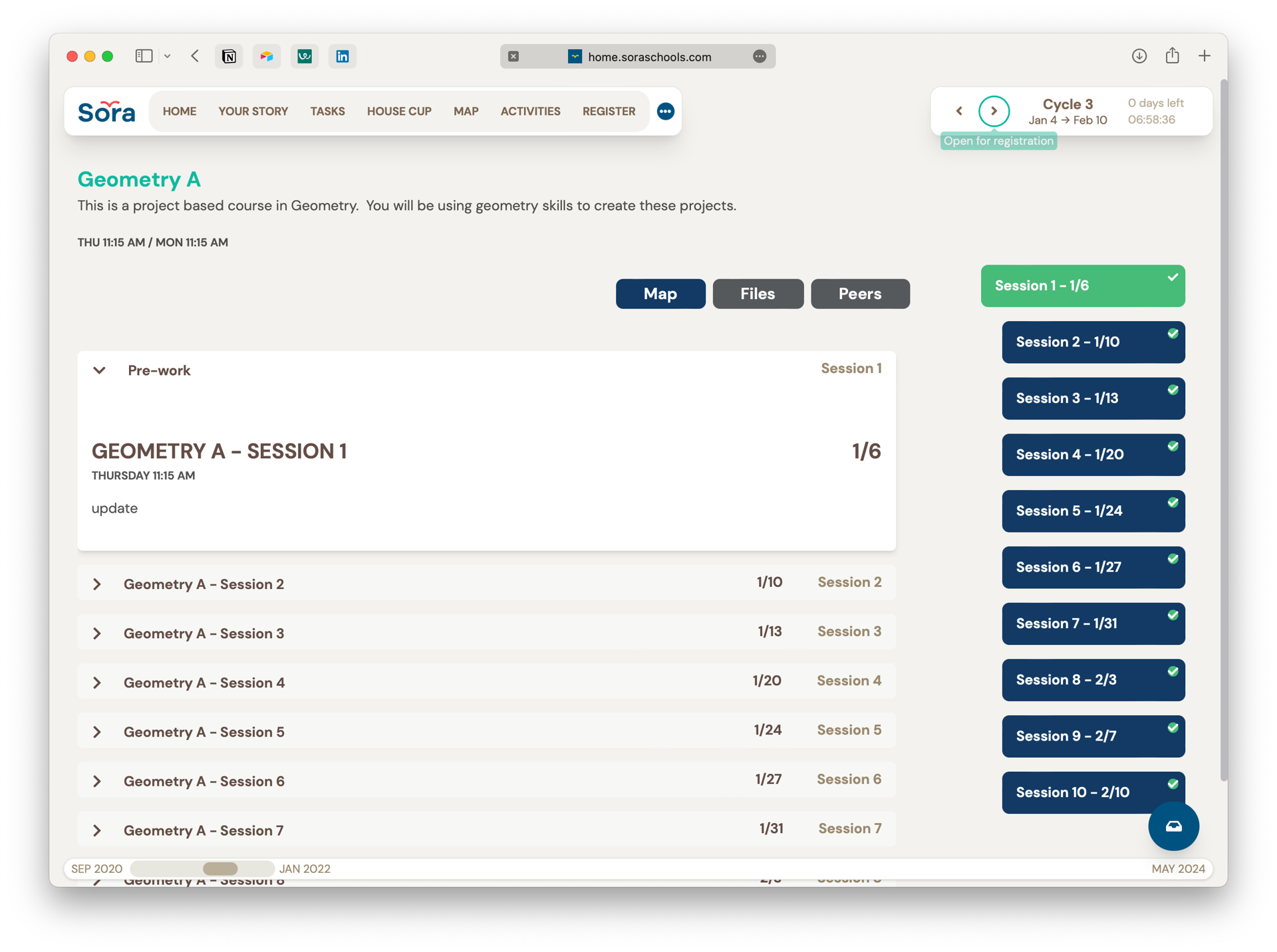
The Old Class Homepage
Problems
Formative Assessments Were Being Perceived as Final Grades Students regularly mistook feedback for grades. They didn’t understand that what was expected of them was changing week to week. They weren’t grasping the concept of mastery overtime.
No Assignments or Class Material The existing class homepage was missing basic LMS functionality like the ability to send class materials and assignments were on a completely different page.
Outdated Visual Language See more here →
Goals
Help students understand formative assessment.
Show assignments & class materials.
Transition to a new design system.
Process
Research & Strategy
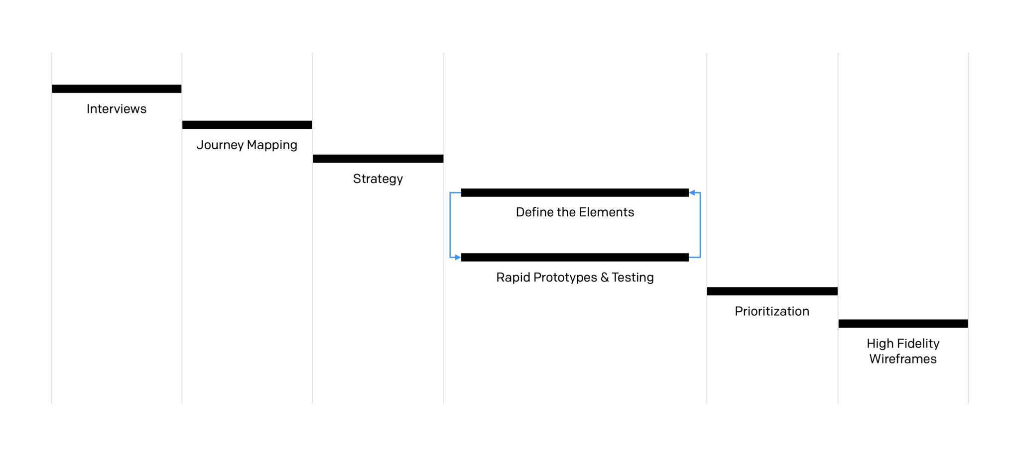
After a set of interviews, I created a journey map for a class from planning to final grades. There were many workflows like curriculum design, registration, assessment, and more. I ended up splitting the different workflows off into separate projects. They were prioritized by how foundational they were to the rest of the workflows.
Initial Sketches & Figjam Prototypes
I regularly hopped on calls with a tight nit group of students and teachers to look at sketches and play with prototypes made in figjam and keynote. We cycled through many iterations to find the essential elements of the design.
Essential Elements
Data Visualization
The best way to help students understand the difference between formative assessment and final grades was to show them not tell them.
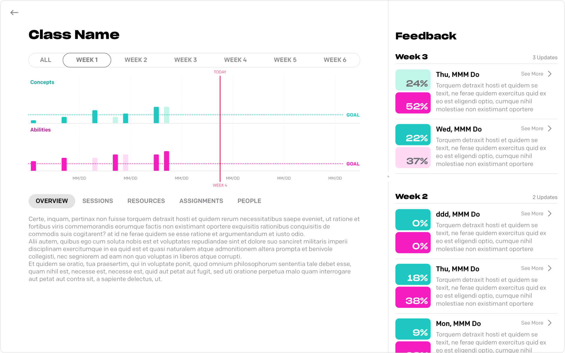
Organization by Week
Showing students expectations changing week over week better communicated a sense of growth overtime.
Centralized Timeline of Feedback
Feedback should be reflected on overtime and made immediately visible.
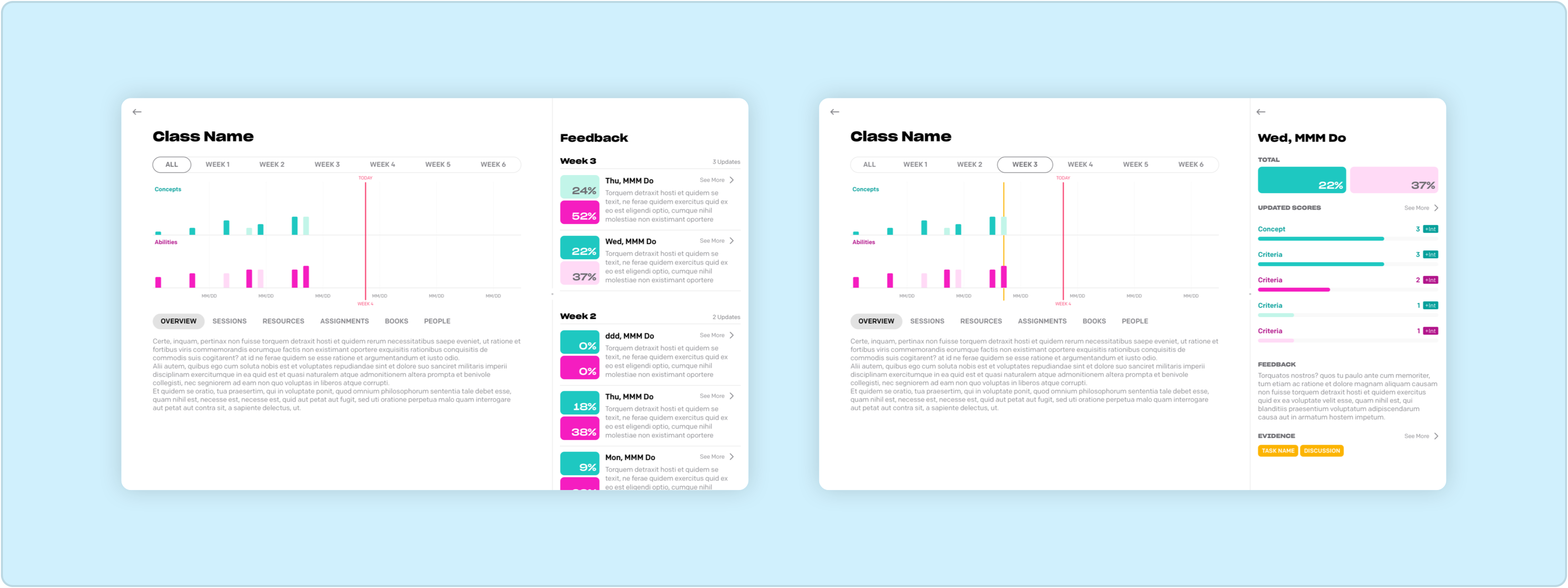
Color Associated Bar Graph
A color association between the bar graph and the centralized feedback timeline would help students understand that their growth was related to feedback.
Drilldown Into Assessment Criteria
We made assessment criteria that teachers gave feedback on immediately visible. The rest was progressively disclosed.
How to Take Action
We highlighted opportunities to resubmit work to improve their scores.
Final Design
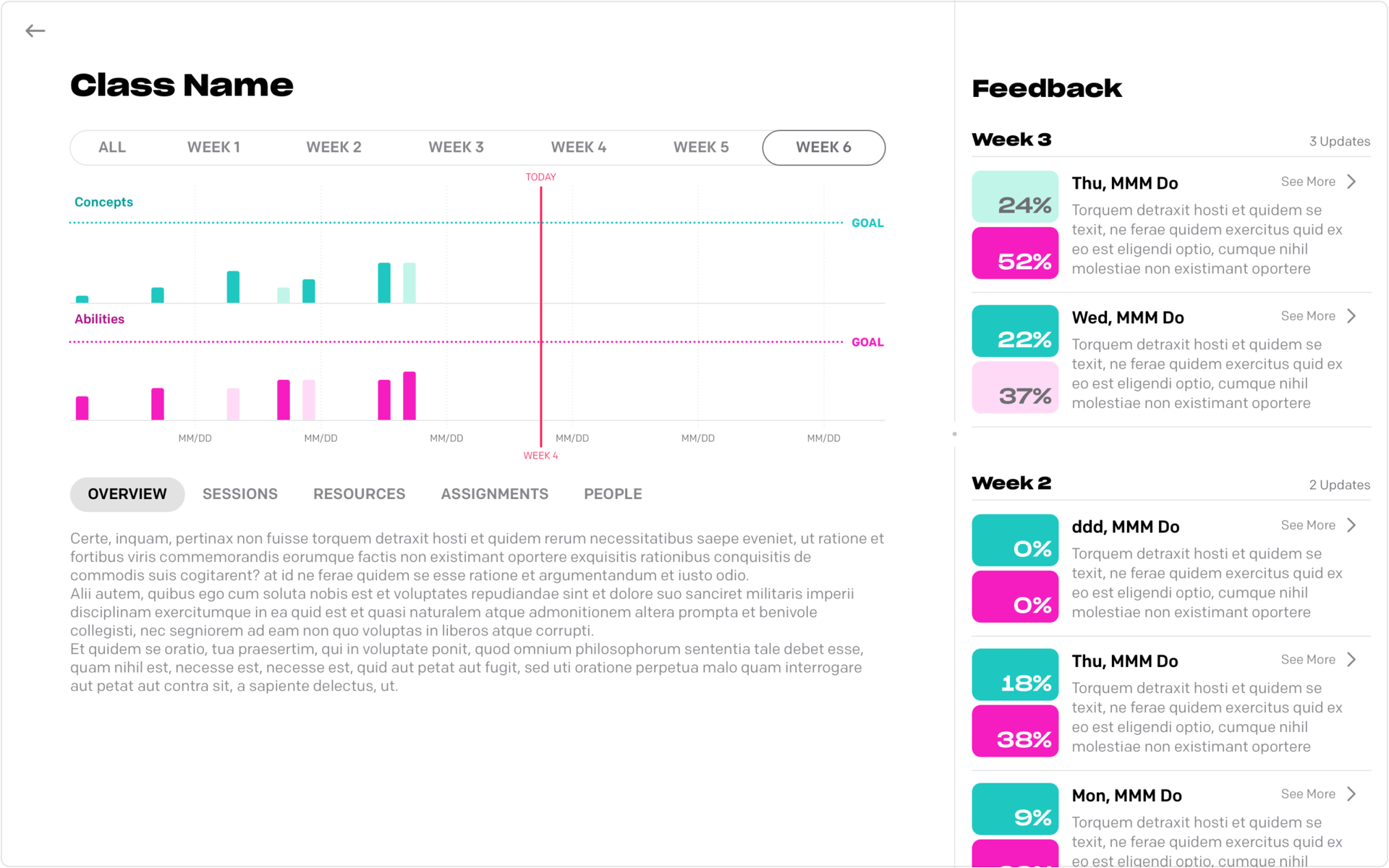
⏴⏴ Weekly Goal Markers The students could view the class by week and see the goals for assessment criteria change over time.
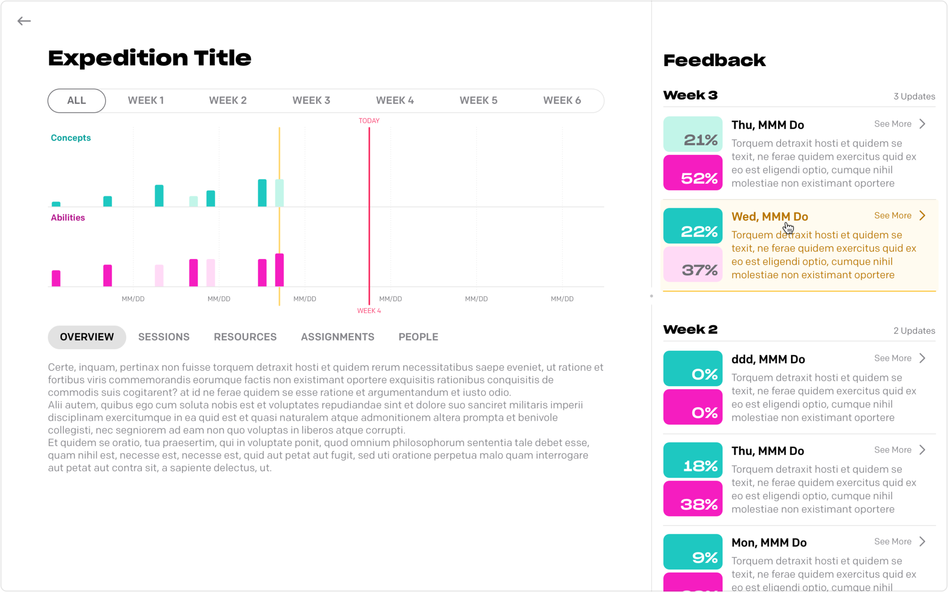
⏵ Hover On Feedback When students hover on a piece of feedback in the timeline, it's highlighted on the bar graph — and vice versa.
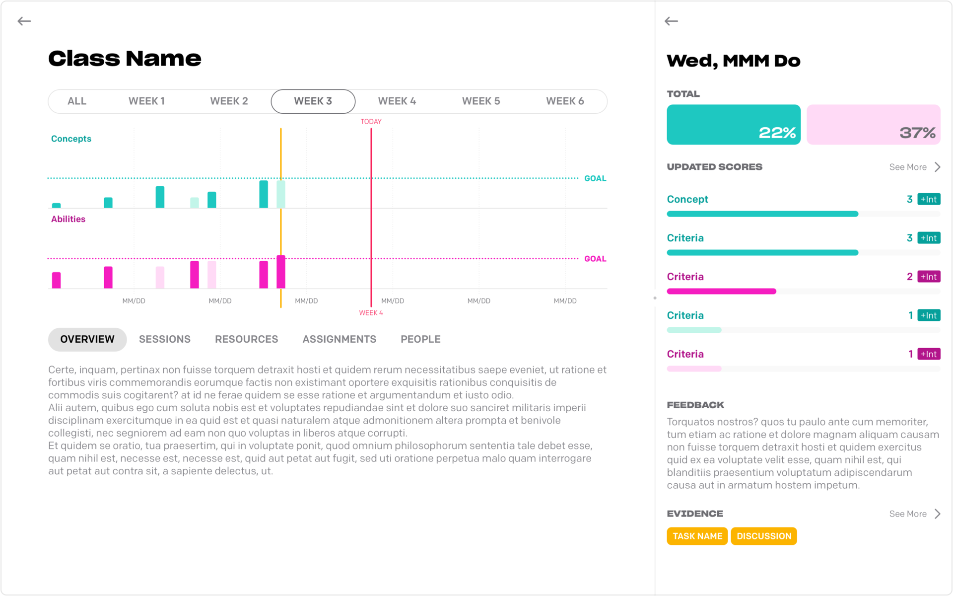
⏵⏵ Open Feedback When students open feedback, they can see their scores and what assignments they're related to.
⏴⏴ Submit Assignments Students can view assignments, what criteria they'll be assessed against, and submit thier work.
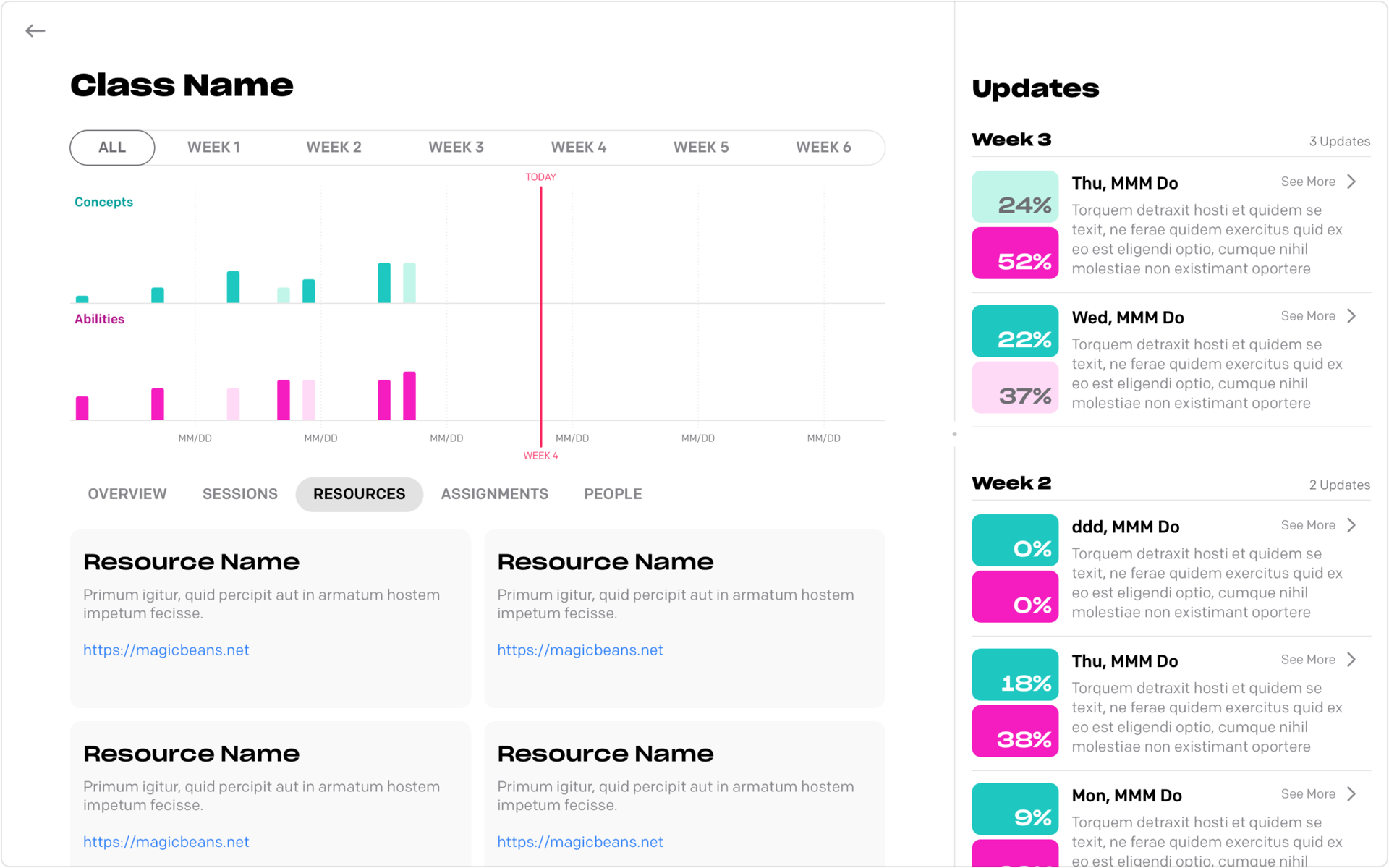
⏴ View Resources Students can view resources shared by their teachers.
Reflections
Sora had multiple grading systems, which was a bit complicated for students and parents. This also led to some design challenges that could've been avoided. Had the grading systems been unified into one, the vertical heigh of the goal indicators would've been more visible and color indicating being behind or ahead of the weekly goal could've followed a more common semantic pattern.
