Sora Assignments
A learning management system for a project-based school
Work
Research
Interface Design
Timeline
Jul 2022 - Jul 2022
Role
Product Designer
Introduction
Sora Schools is an online private school. The school is self-paced and project-based. The school gives students a lot of free time to work on their assignments independently and organize their schedules. Students were consistently turning assignments in late due to some confusion. Students were also free to use either Canvas or Sora's own LMS. Our goal was to redesign Sora's LMS addressing both it and Canvas's problems.
My Role
I was the product designer. I worked with one engineer and product manager.
Problems
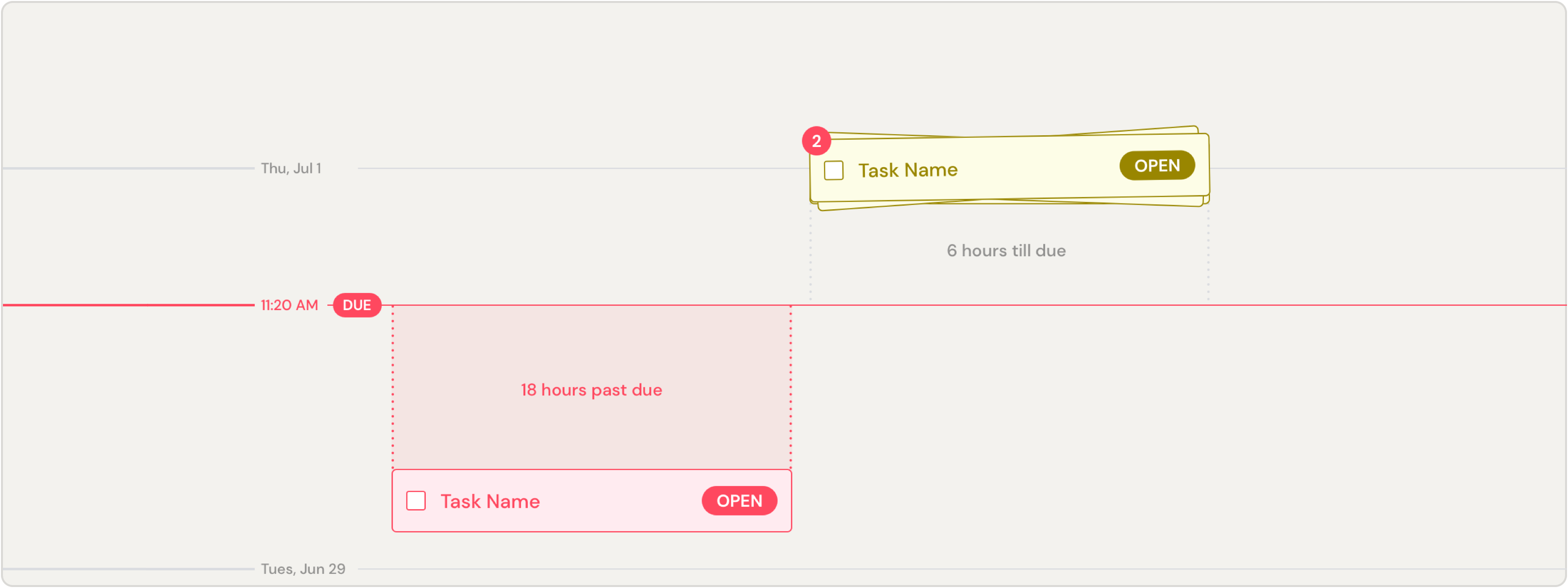
Due dates were not immediately visible. We conducted a bunch of first-click tests on different interfaces. We noticed that kids struggled to identify due dates on the ones where it was shown in text. No matter how large the due date were, kids always identified the due date faster in interfaces where the dates were show spatially. This was because text displays did not communicate the time between the current date and the due date of the assignment.
There was no urgency to get assignments done. Kids told us that they didn’t feel a sense of urgency to get tasks done. Some also articulated difficulty with defining an order to work on tasks. Others said that due dates would slip their minds.
Kids manage time in different ways. Sora attracted students on the opposite side of the executive function spectrum. Both Canvas and Sora's previous LMS couldn't cope with student's differing needs.
Goals
Clearly communicate how much time students have to work on their assignments.
Create a sense of urgency to get assignments done.
Offer students flexible ways to manage time
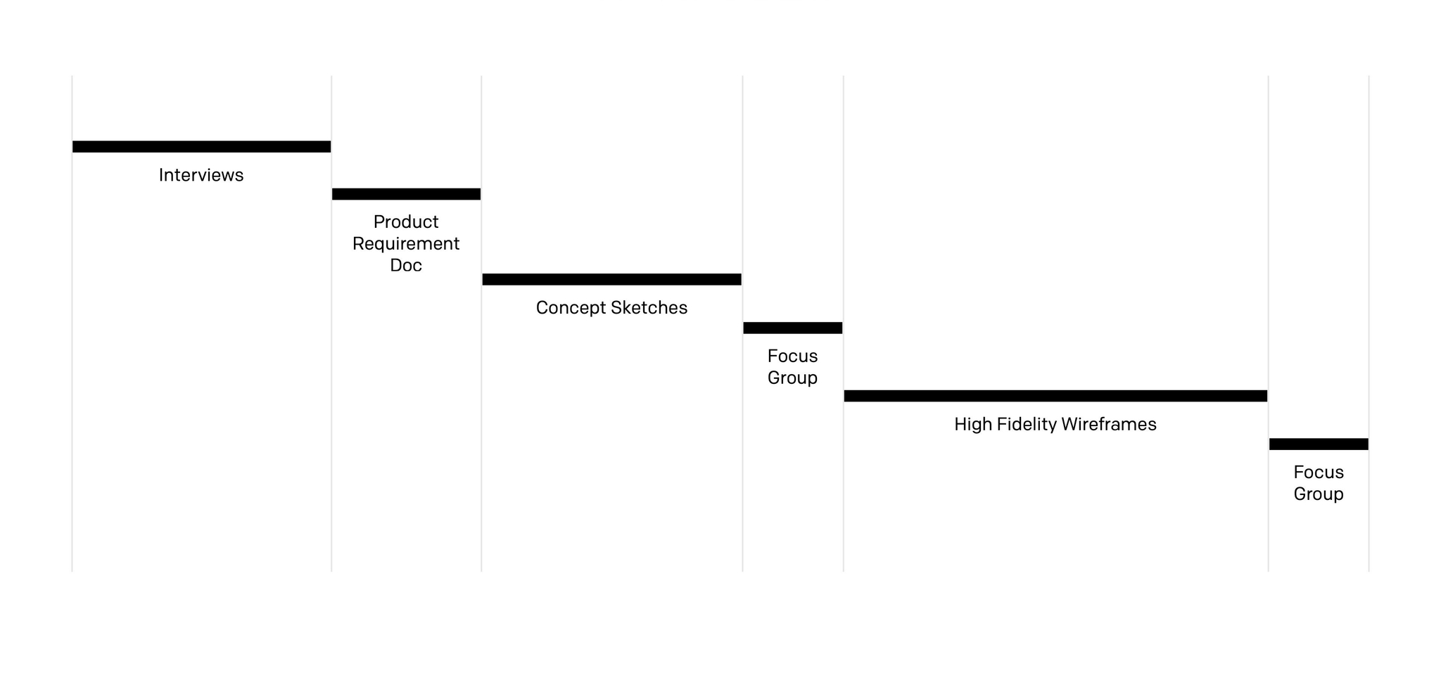
Process
What We Shipped
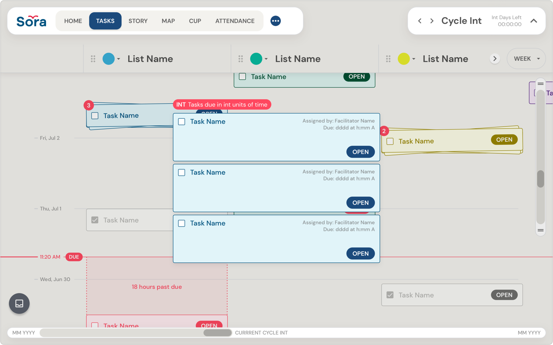
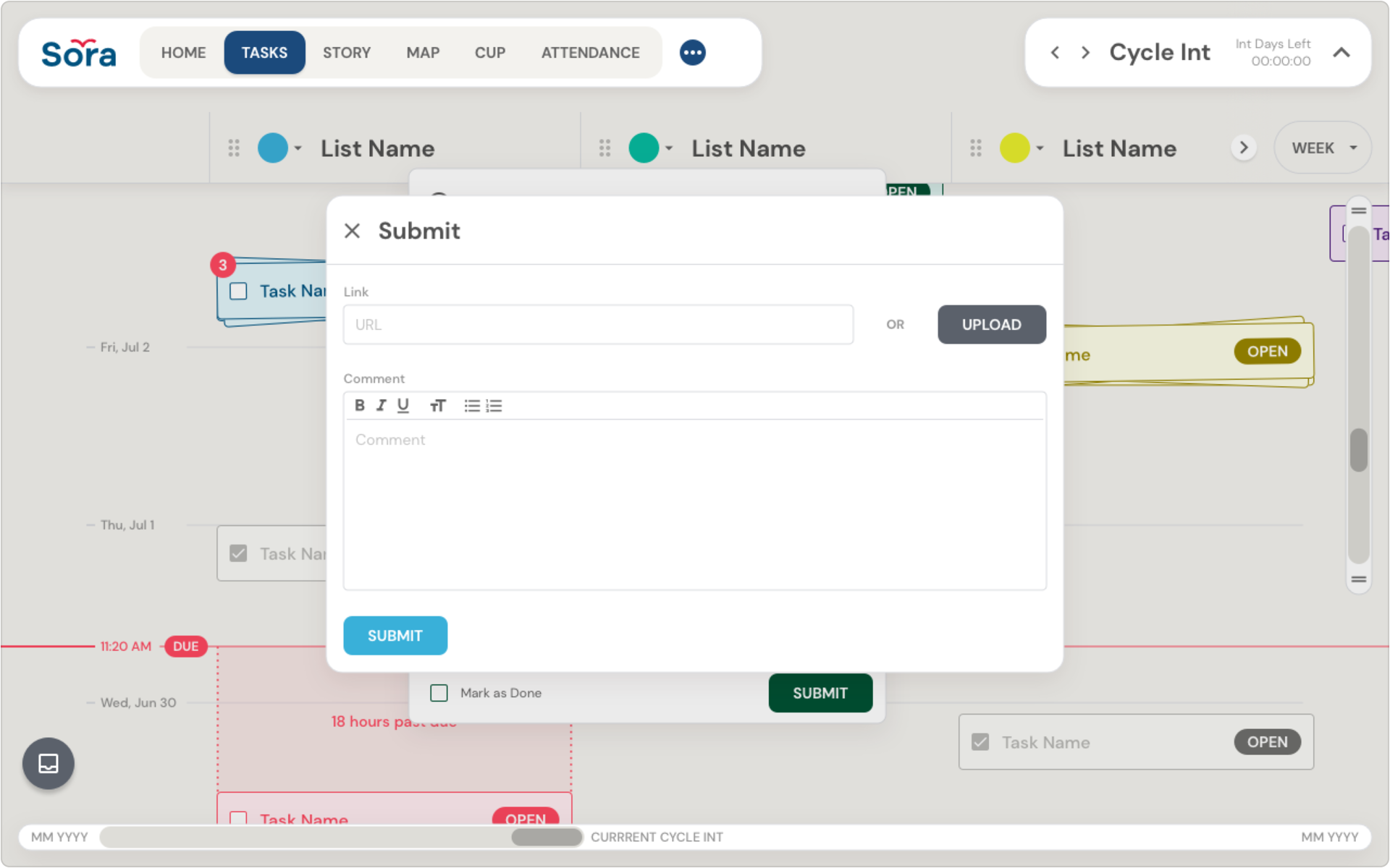
⏴⏴ Time Displayed Spatially Due dates were made more immediately visible by laying them out spatially rather than in text.
⏴ Stacks Tasks due at the same time were stacked on top of each other
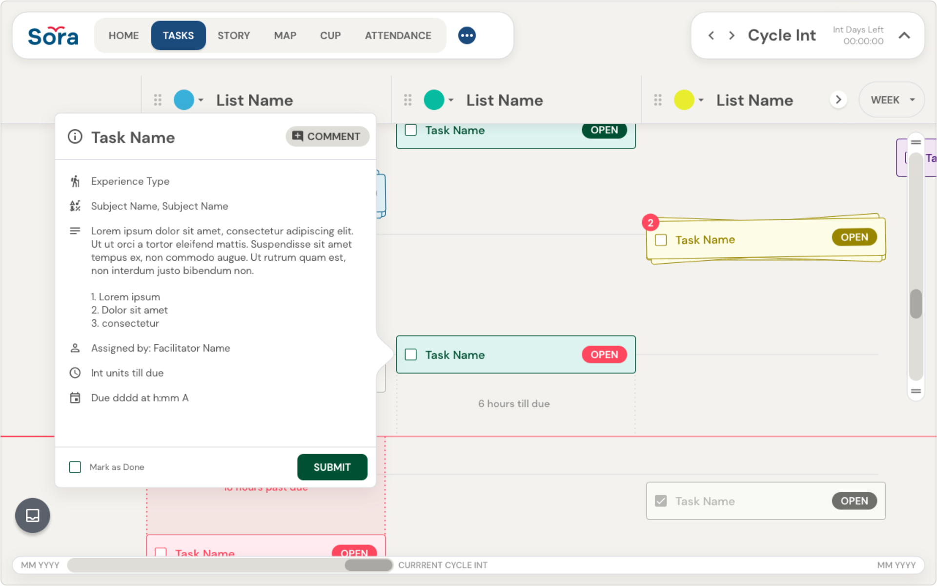
⏵ Popover More details and information about the assignment can be found in the popover.
⏵⏵ Submit add links, files, or comments to assignment submissions.
Reflections
This was my first project at Sora. Throughout the process, the absence of a design culture was very clear. The school admin team had never worked with designers before. They were not used to the amount of "trespassing" that's normal for designers. The essential elements behind projects weren't being clearly defined. And, the inconsistent components created usability problems. After this project shipped, the product team worked together to revamp our process.
