Naboo
Prequel's UI Framework
Work
Design System
Product Leadership
Strategy
Timeline
Jul 2022 - Dec 2022
Role
Head of Product
Introduction
Prequel was building career-development programs for highly ambitious teens. Our programs were created for teens who wanted to start their careers right away. Teens in our programs started their first businesses, shipped real code, built their audiences, and made investments.
Most ed-tech is built upon the principals of industrial education. It's built around the idea that teachers hold knowledge and pass it along to students. Prequel, and other companies like it, were building programs more inline with the dynamics of the post-industrial school era. In the post-industrial school era, people learn by exploring and creating knowledge rather than being passive consumers. This pattern of behavior is vastly different than the patterns observed in industrial education. The design challenges were very different as a result.
Challenges
Users have more than one role. Anyone using Prequel can create or share knowledge. Unlike most industrial ed-tech apps, the roles and permissions of users are not as clear cut. We needed to create a design system that's approachable for consumers and powerful enough for pros without creating a divide between them.
Co-creation & consumption are happening at the same time. When learning by doing, users switch between the mode of creating and consuming. We needed to make sure that users had access to tools for both without having to switch modes.
Goals
Shape the organization to fit the future of education.
Handle precise user inputs while keeping the surface clean.
Leave room for other brands & personalities.
Considerations
Sophisticated Capability, Simple Appearance.
We needed a design system that would keep the surface clean, while remaining capable. We prioritized a lot of design principals like "Direct Manipulation", "Spring-Loaded Modality", and "Progressive Disclosure".
Immediate Feedback
We needed a design system that would give users immediate feedback on their inputs. We prioritized the interface being the content its self, increasing the interface's feedback, feedforward, and forgiveness.
Detached From Existing Metaphors
We needed a design system that did not impose existing educational concepts like "Assignments", "Classes", and onto our customer experience. We needed to avoid terms and metaphors that would restrict user's perceptions about how our apps and services would function.
Foundation
Typography
As we were designing for dense information architectures and sophisticated inputs, many components in the design system would have small typography. To make sure the interface stayed legible and presented reliably, we opted for the system typography.
body { font-family: system-ui, "Segoe UI", Roboto, Helvetica, Arial, sans-serif, "Apple Color Emoji", "Segoe UI Emoji", "Segoe UI Symbol";}Common System-UI typography has quite a few features that come for free with their use.
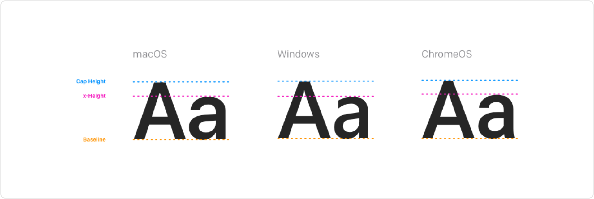
Tall X-Heights & "Metric" Cap Heights
Tall x-height increases legibility at small sizes.
The distance between the baselines and cap heights are equal to their interline spaces, allowing for consistent vertical positioning.
Neo-Grotesque
Both SF Pro and Roboto are neo-grotesque typefaces. Their consistent width throughout their strokes keep them neutral and easy to pair with other brands. Though Segoe is a humanist san-serif font, it also presents very neutrally.
Naboo's type ramp on macOS, Windows, and ChromeOS
Layer Styles
Minimal Layer Styles
We wanted to keep the surface as clean as possible and for the materials to be honest. We decided not to use shadows and relied on the layout and color to define hierarchy. As a result, we had a minimal amount of layer styles: Borderless, Divided, and Outlined.
Box Sizing & Overflow
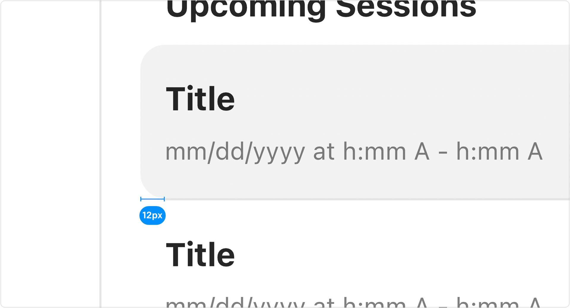
To keep the content aligned with the box-bounding presented to the user, we decided to have the background overflow 12px outside of the border-box.
Layout
Low Modality
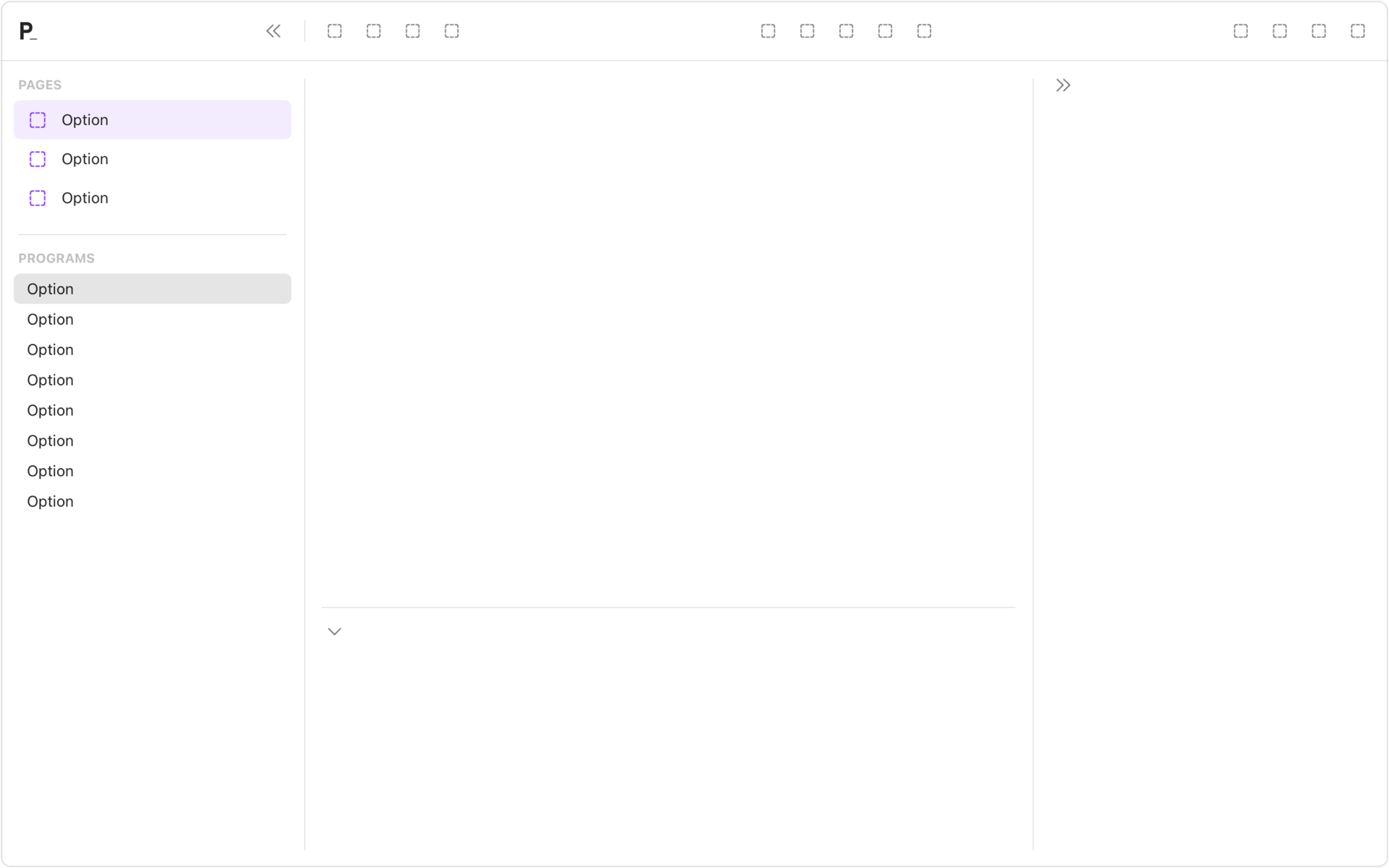
We wanted to users to feel a sense of control. The layout was designed around tools being used in spring-loaded modes rather than paginated views.
Left-to-Right
To prevent users from being overwhelmed, we used a left-to-right interaction pattern. Everything to the left was stable and consistent. Everything to the right was more detailed and modal.
Panels
All of the surfaces were compostable panels. They used the same dividers with 16px gaps and had the option to have a toolbar at the top. Panels could extend the details of any object indefinitely.
Example Implementations
An AI Powered Learning Experience Design Tool
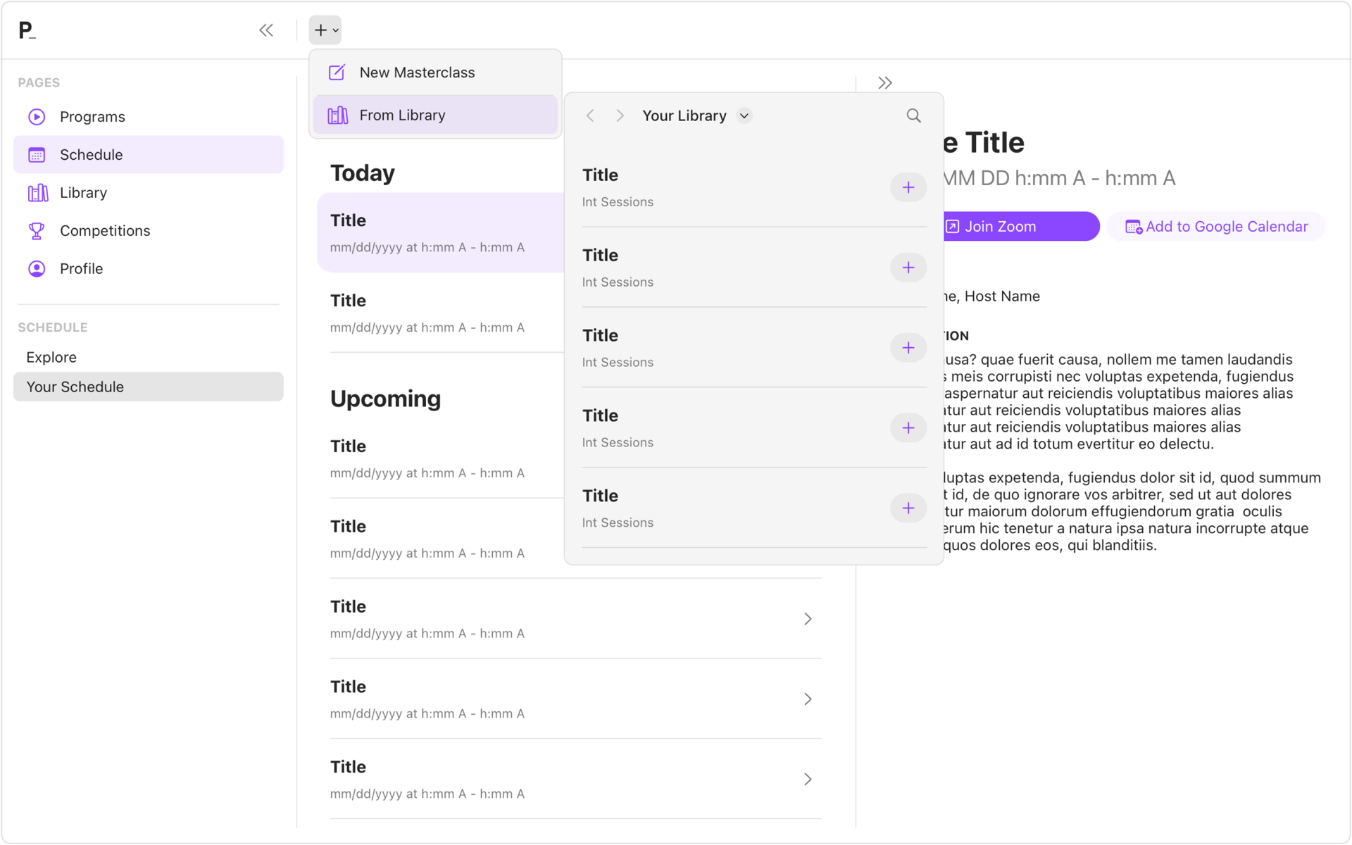
A Class Scheduling Tool


