Cursor Chat
Show code to your built-in pair programmer.
Work
Interaction Design
UX/UI
Timeline
2 Days
Role
Product Designer
Introduction
This was a very short project for an AI-first code editor, Cursor. Cursor's users were having a difficult time understanding what code the chat could "see". In this project, I added affordances showing what the chat could possibly see, created a more direct way of adding code to the chat, and better communicated the state of what the AI was "looking at".
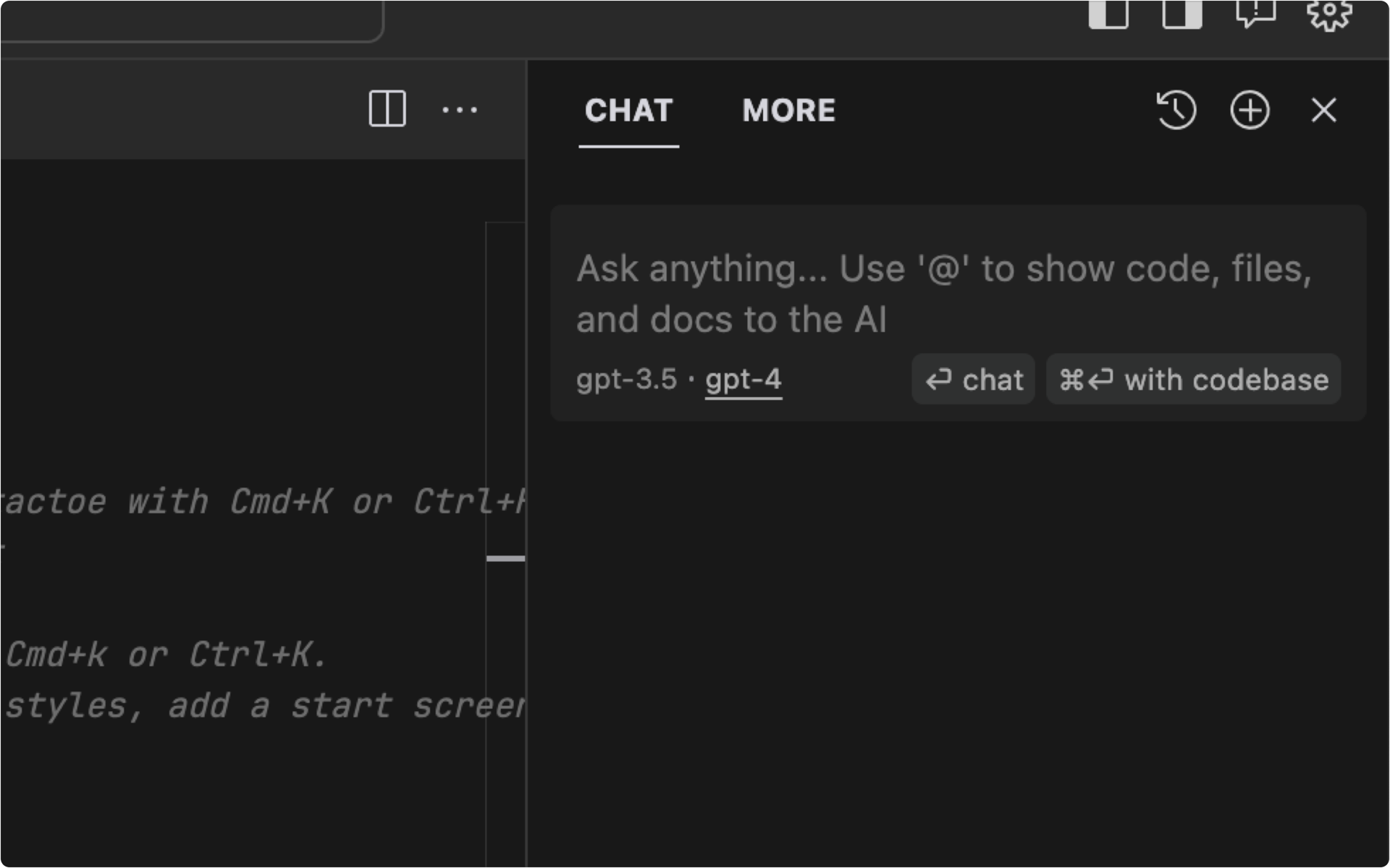
The Existing Chat Interface
Problems
Users don’t have a clear understanding of what code the chat can "see".
Common Chat Visibility Choices Are Hidden. Discovering what the chat can “see” requires users to read the chat placeholder text and buttons. There are a lack of obvious affordances indicating the ability to control what the chat can and can’t see.
Object Manipulation Between the Editor and the Chat Are Inconsistent. Navigating code in the editor is different than navigating code in the chat. The user can’t transfer their knowledge from the former to the latter. This makes the interface harder to learn and explore.
The User and AI Have Different Locations of Attention. The user and the AI have independent loci of attention. When starting a chat, the user initiates their locus of attention by clicking on the chat input. The field then enters a focused state, communicating the result of user input. However, the user hasn’t initiated the AI’s locus of attention, and is therefore unaware of it’s state. Because the user is unaware of the AI’s state, they are essentially stuck in a mode; decreasing user control. Jef Raskin's Definition of Modal Interfaces →
Goals
Show the possible options of what the chat can "see".
Make the AI's code selection easier to learn.
Communicate the state of the AI's attention.
The Design
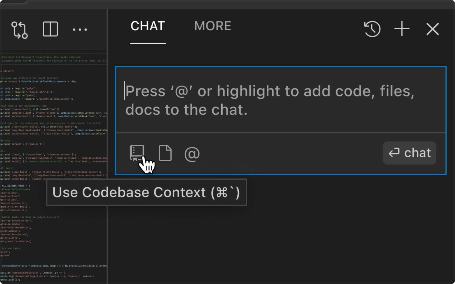
Affordances & Multimodal Input
Add toggle switches and keyboard shortcuts to better communicate the possible actions of the interface.
Direct Manipulation
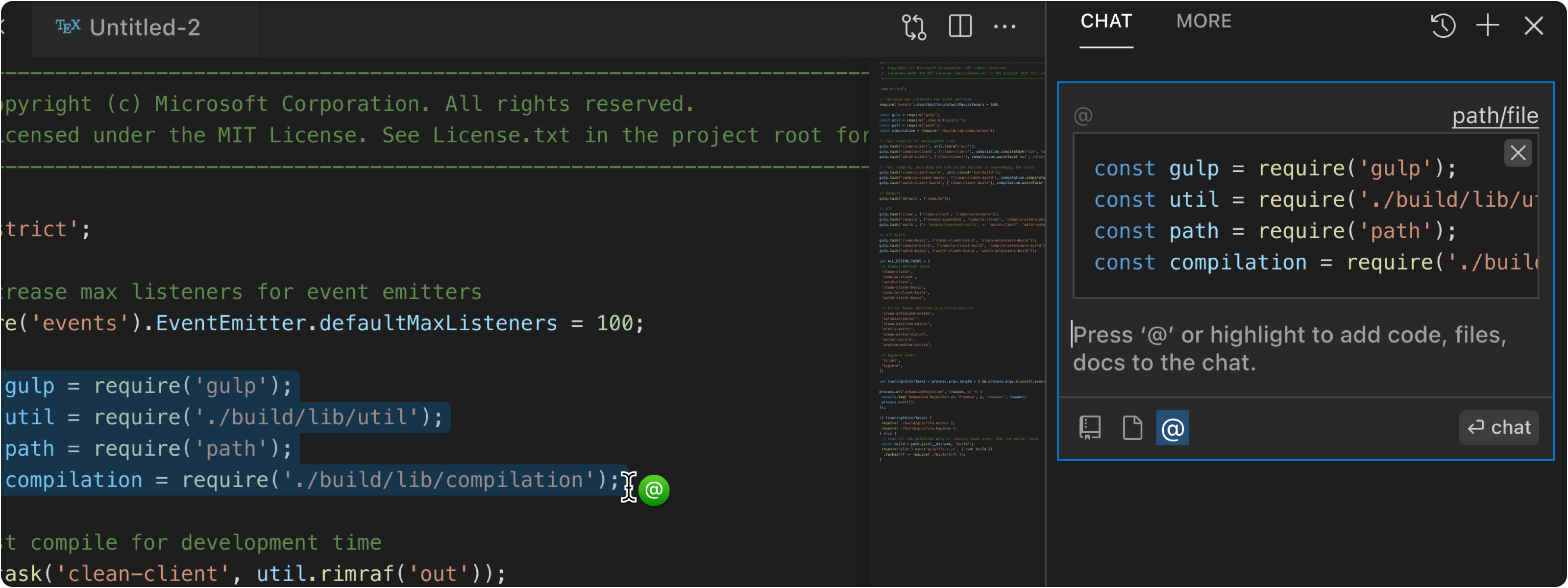
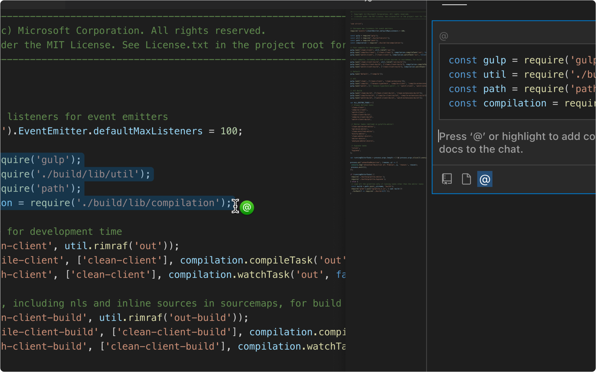
While the chat is in focus, if the user clicks on a file or highlights some code, add it to the chat. Consistency between code selection in the editor and chat will help users transfer their knowledge from one interface to another. The use of similar stimuli will also help with making the interaction more memorable.
Short-Term Modality
When the chat is in focus and the user is hovering on files and code, display the state of the AI’s attention with an ‘@’ icon cursor / pointer. Awareness of what the AI can “look at” will give the user a greater sense of control.
Reflections
Though we limited this project to showing the user what the chat can "see", we did not spend much time connecting the company's objectives to the product opportunity. There were other opportunities such as removing the chat as a whole and merging it with the code generation interface that were not explored. A clearer sense of the roadmap, product usage, and priorities would've led to a more focused exploration.


